Mobile Customizer
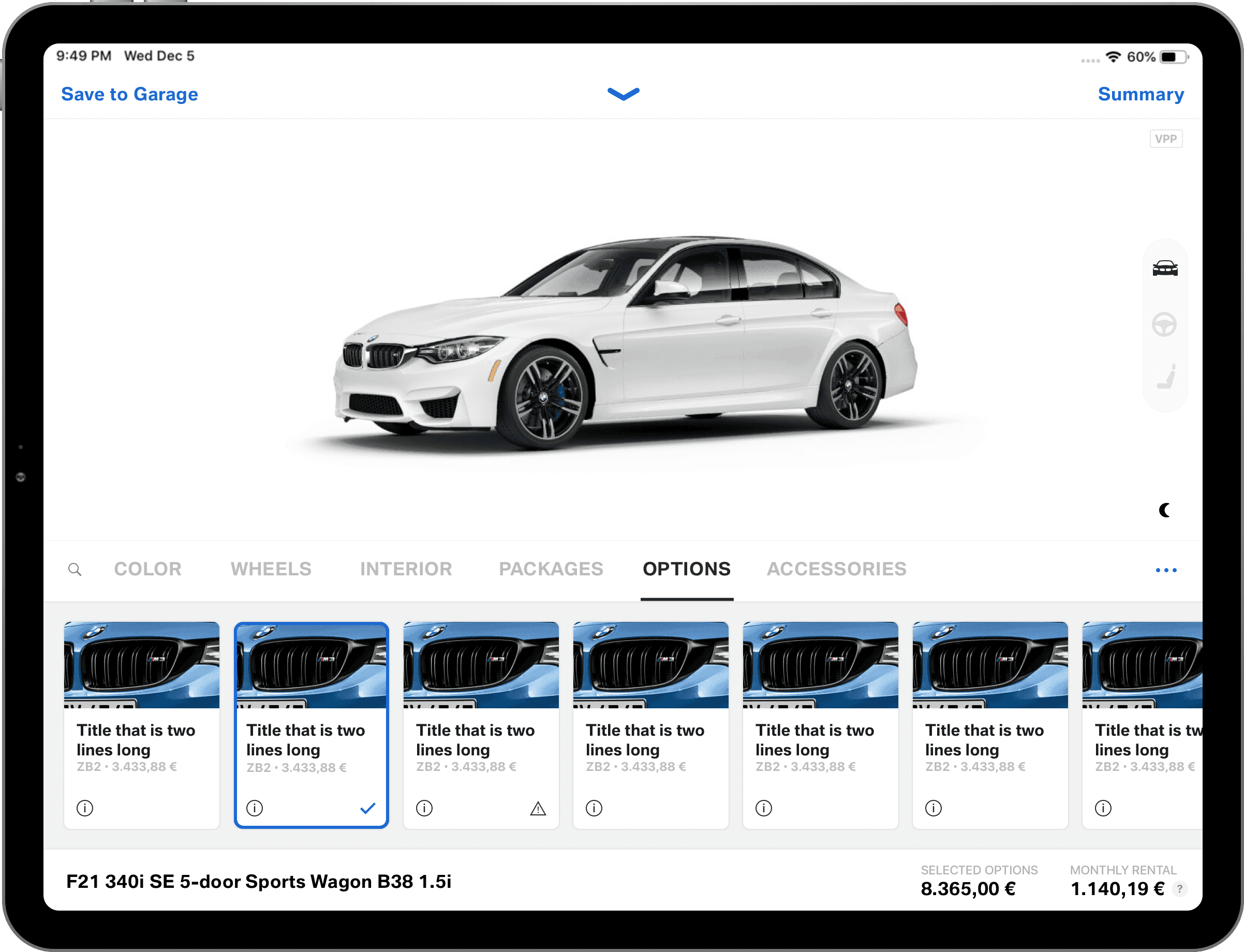
A ground-up redesign of the iOS app BMW and MINI dealerships use worldwide to walk customers through a custom order, right from the showroom floor. Full concept and design, built with my team during eight years at BMW.
Overview
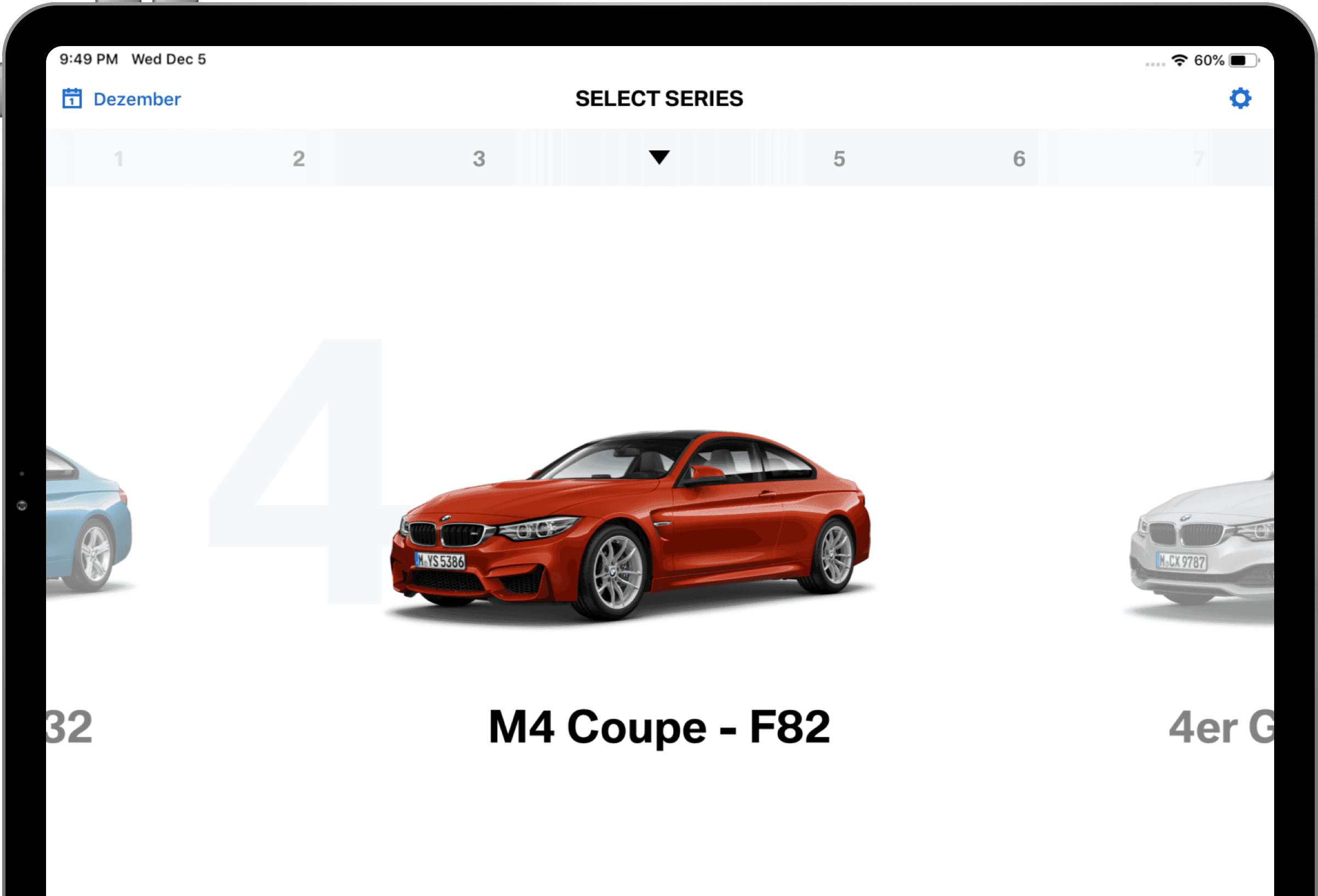
Background. BMW and MINI dealerships previously used a desktop-only web app to walk customers through the custom order process, but were notably limited without a mobile version of this application. Associates needed the ability to browse, configure, and preview vehicles with the customer, directly from the showroom floor.
My role. My role was to create the overall layout and navigation of the UX, and style the UI to fit iOS but still feel like a BMW app.
Our team reimagined and rebuilt the entire application. A brand new user flow with modern UI paved the way for new features to support dealerships across the world.
Challenge
The features and data available required a lot of planning for a native app design. We needed to cut through it and find a clean path for the user to move through.
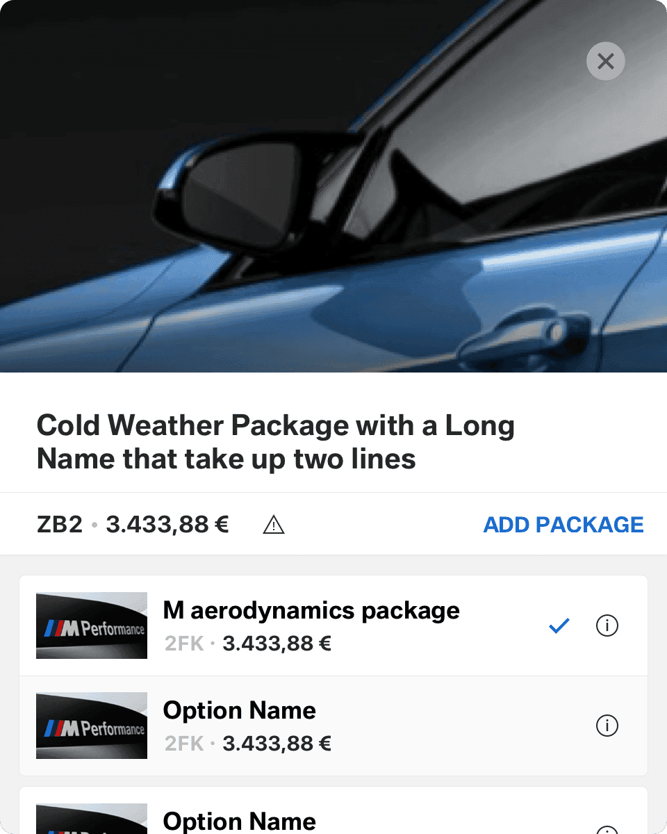
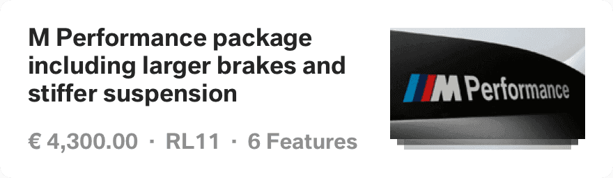
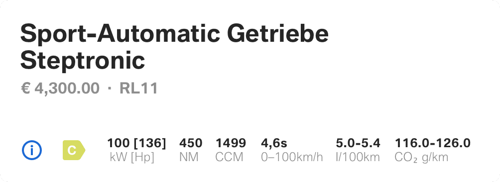
Each market, or country, describes their vehicles and features individually, meaning we had a lot of unique data to work around. A vehicle title could be as short as two words — or it could be two sentences. Features could also be tricky since not all had visuals to design around and some features were actually a collect of sub-features presented as a single item. These inconsistencies were across the board, and gave us lots of fringe scenarios to account for.
Beyond that, we needed to structure the navigation to handle new features over the next few years so we weren’t painted into a corner.
Solution
We worked through a variety of layouts, ultimately deciding on a bottom tab bar navigation to give us future flexibility; this allowed each item in the bar to focus on one area of the configuration process, with all eventually leading to the vehicle customization screen.
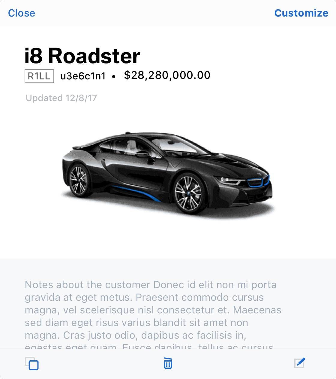
While this seems like a simple solution, it involved convincing multiple decision-makers to shift their thinking on the UX of this product. Getting this pattern settled was a keystone moment for moving this application forward. Once we had that locked in, we could layer additional features onto the customization screen knowing that the user had a consistent way to arrive there.