
Jotkin iOS App
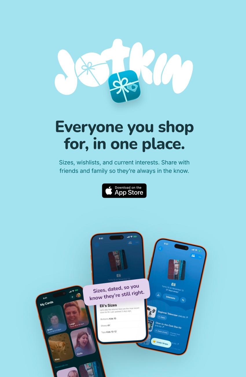
An iPhone app that keeps the sizes, wishlists, and interests of everyone you shop for in one place, shared with family so everyone stays in the loop.
Here’s an overview from idea to the App Store, plus a few key decisions along the way. Let’s go!
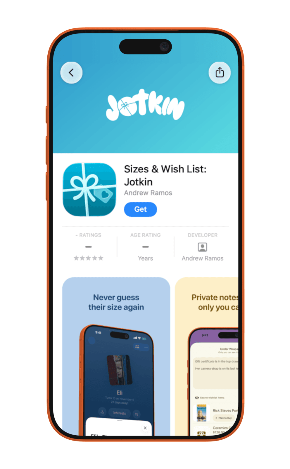
- App Store
- Download
- Website
- jotkin.app
- Build log
- 9 updates
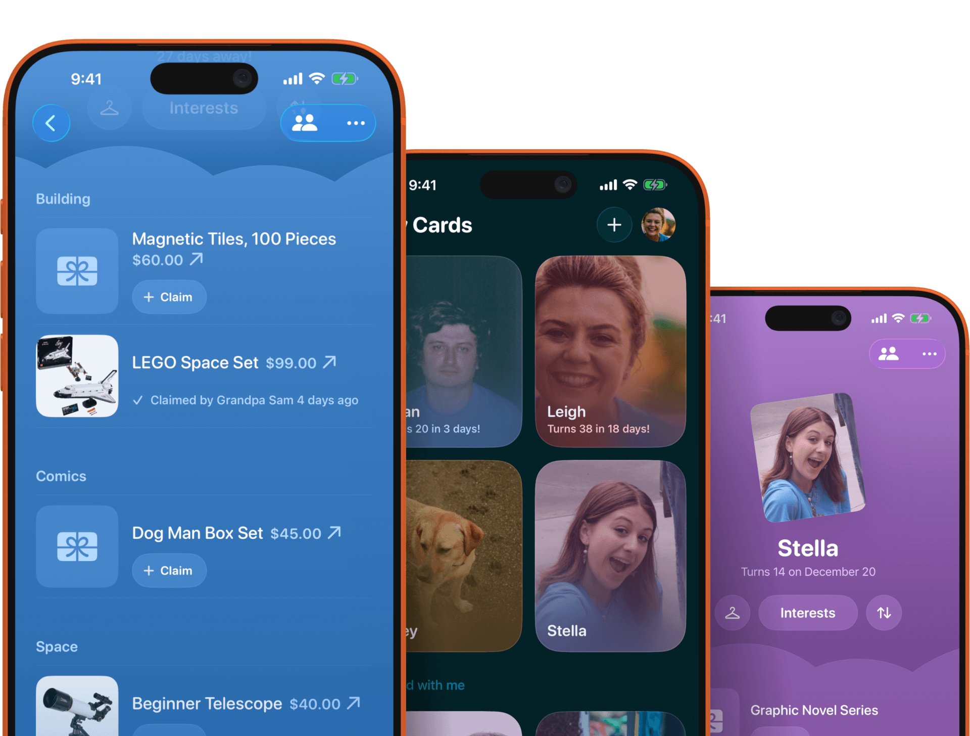
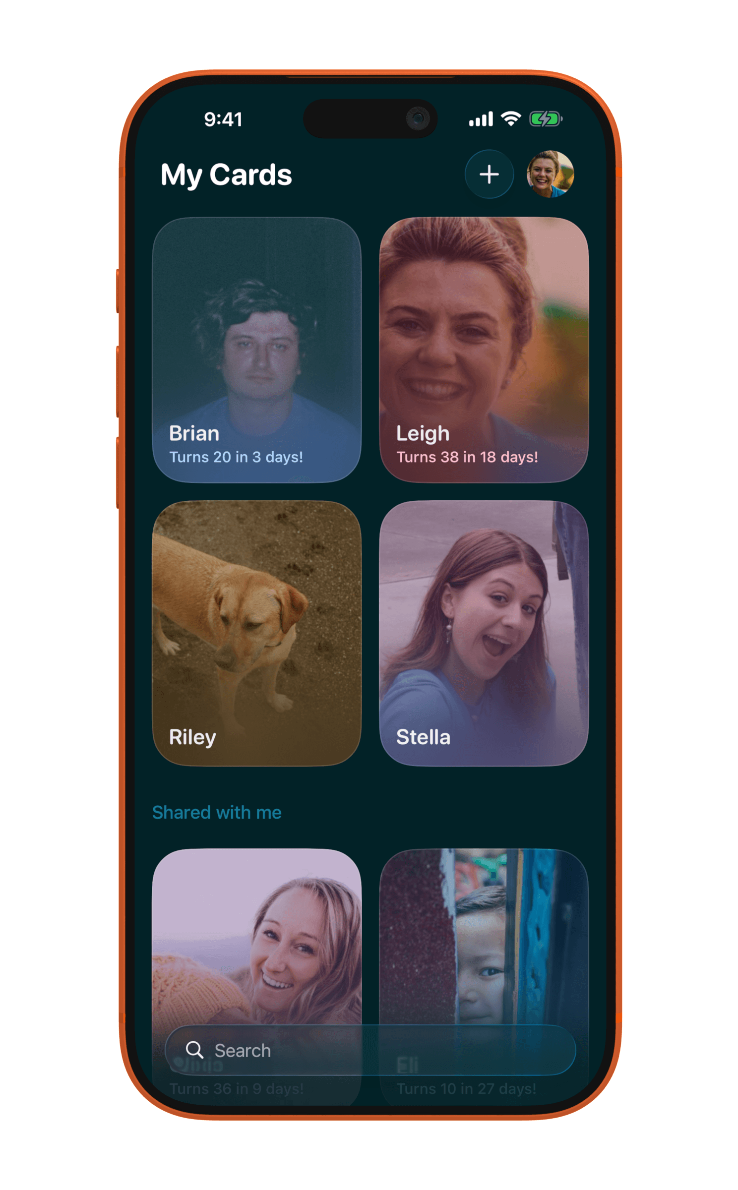
My Cards
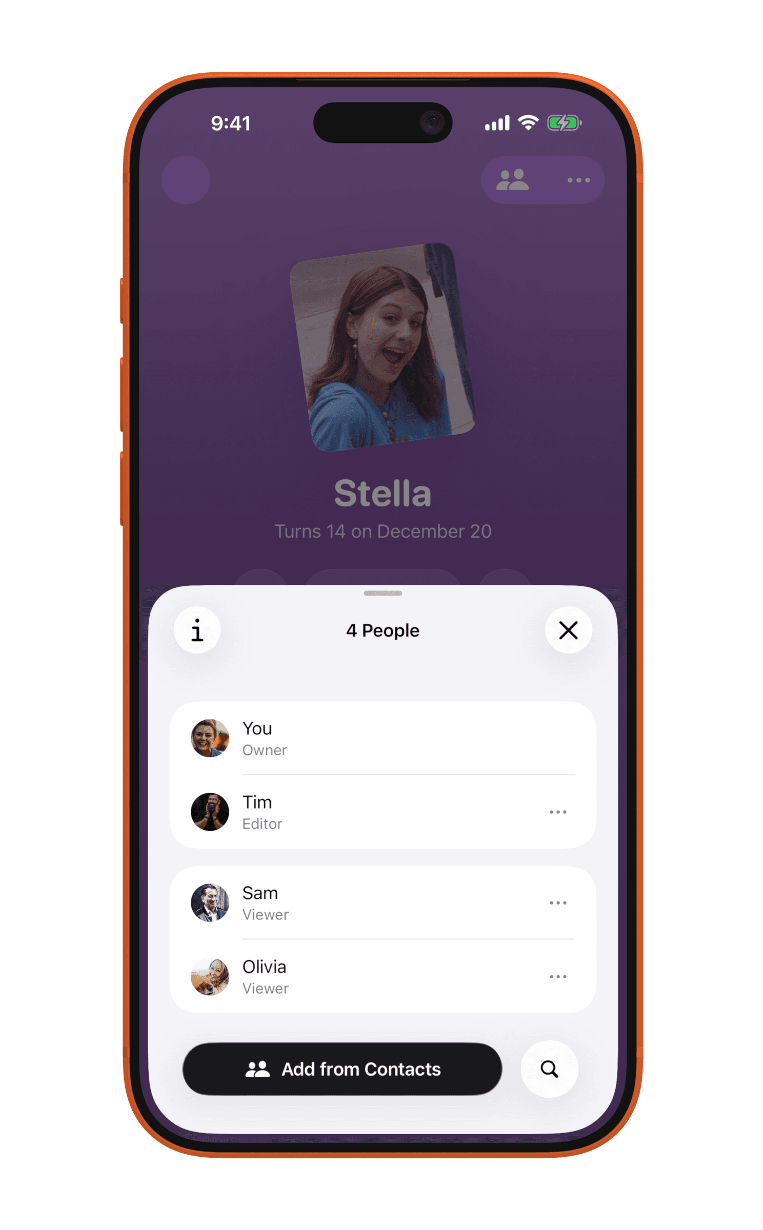
Sharing a card
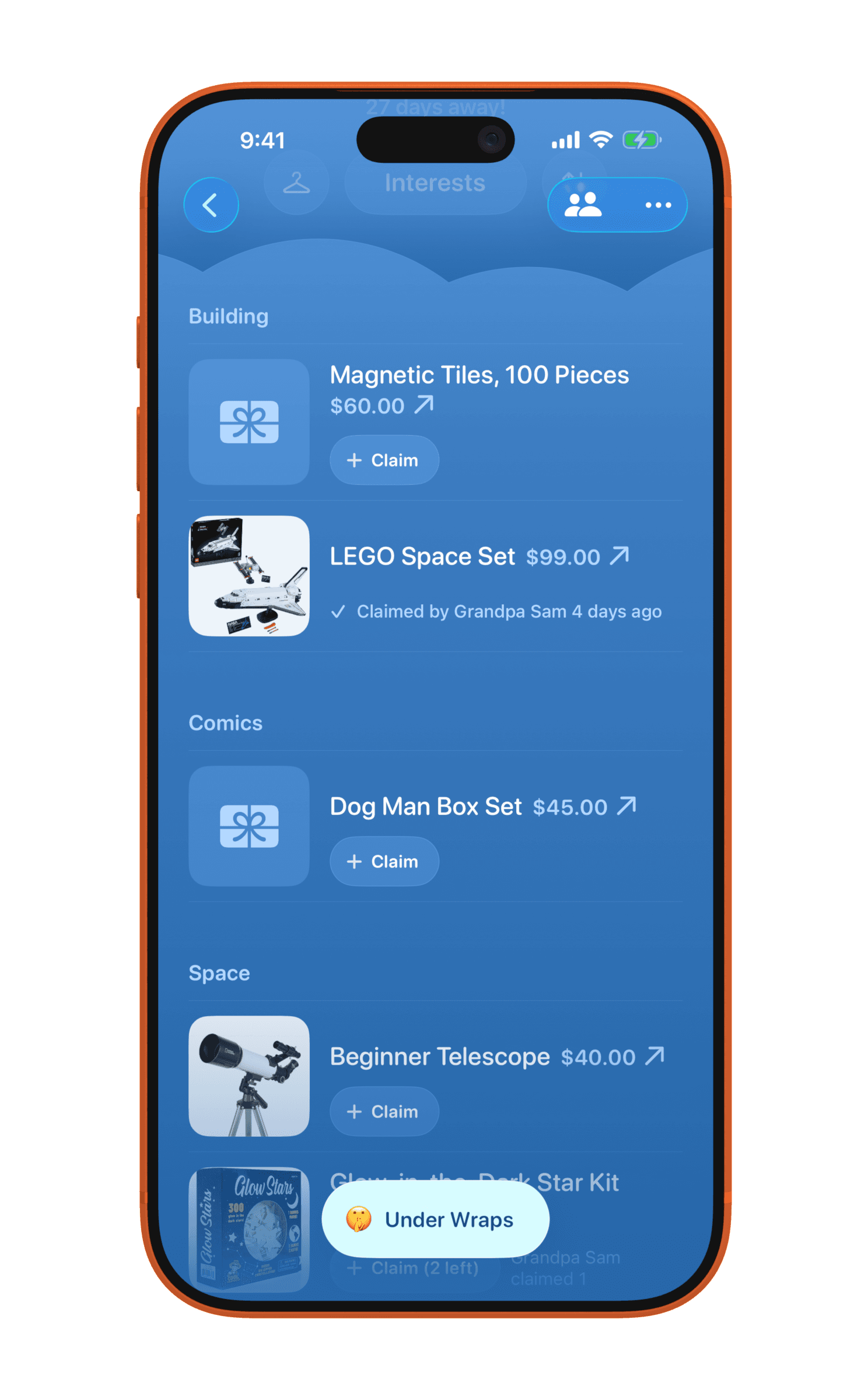
Wishlist sections
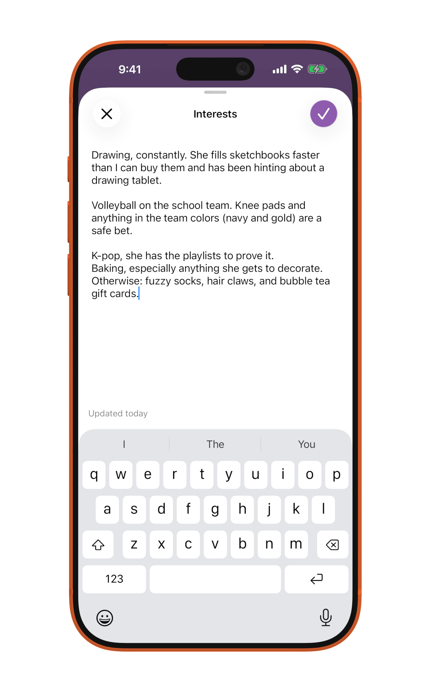
Interests
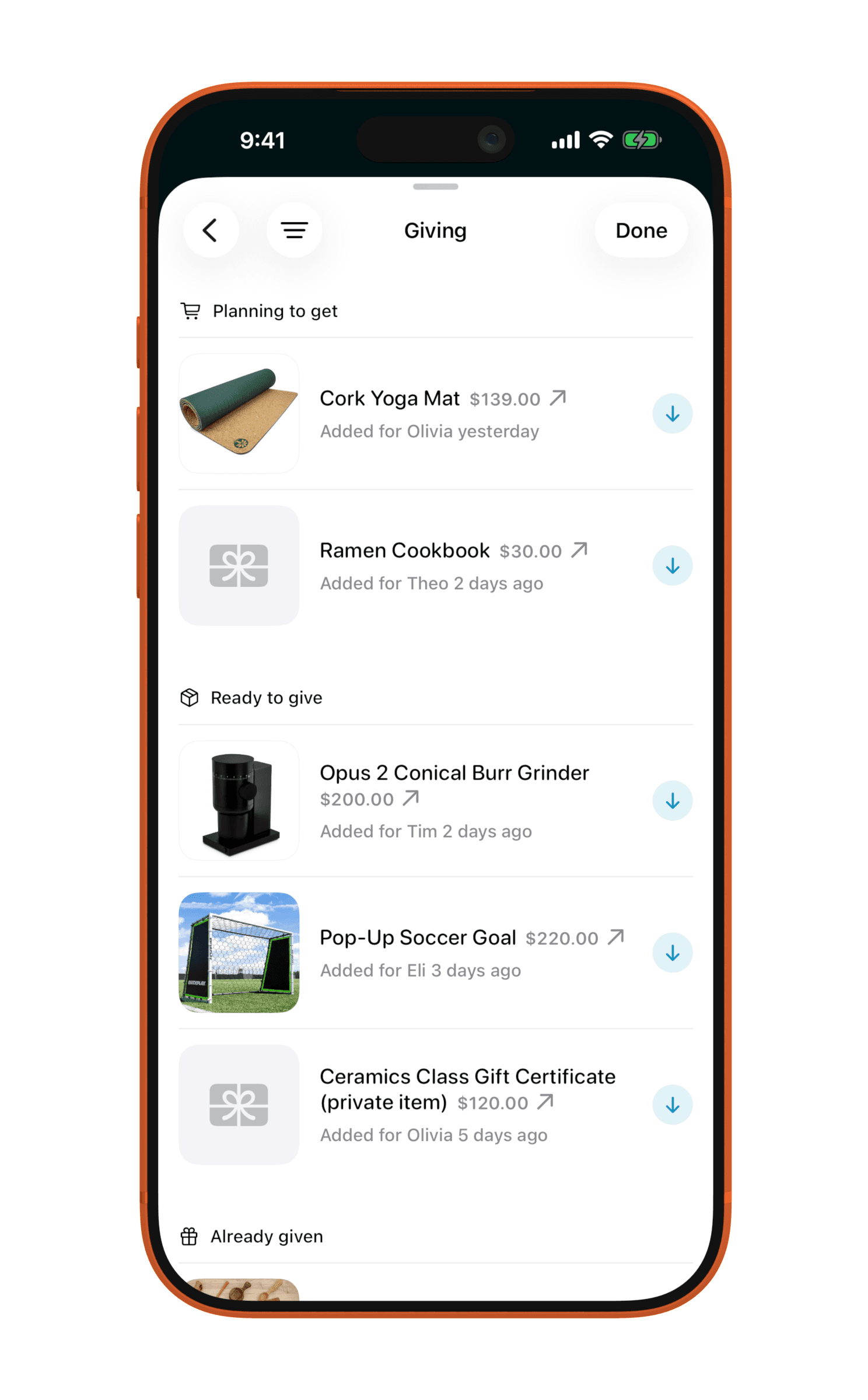
Giving
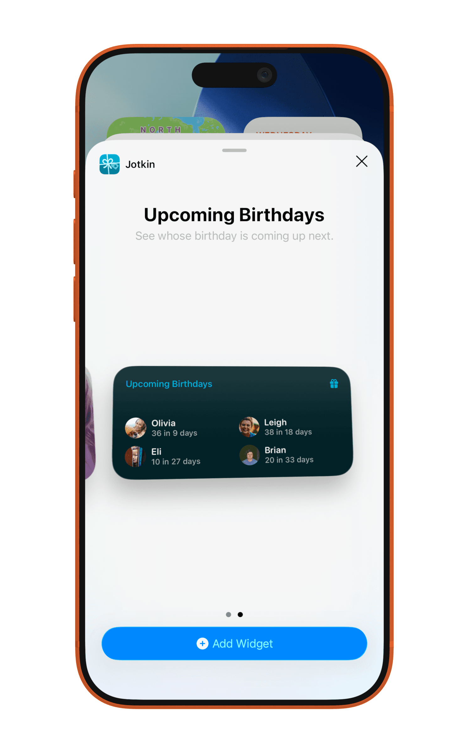
Upcoming Birthdays widget
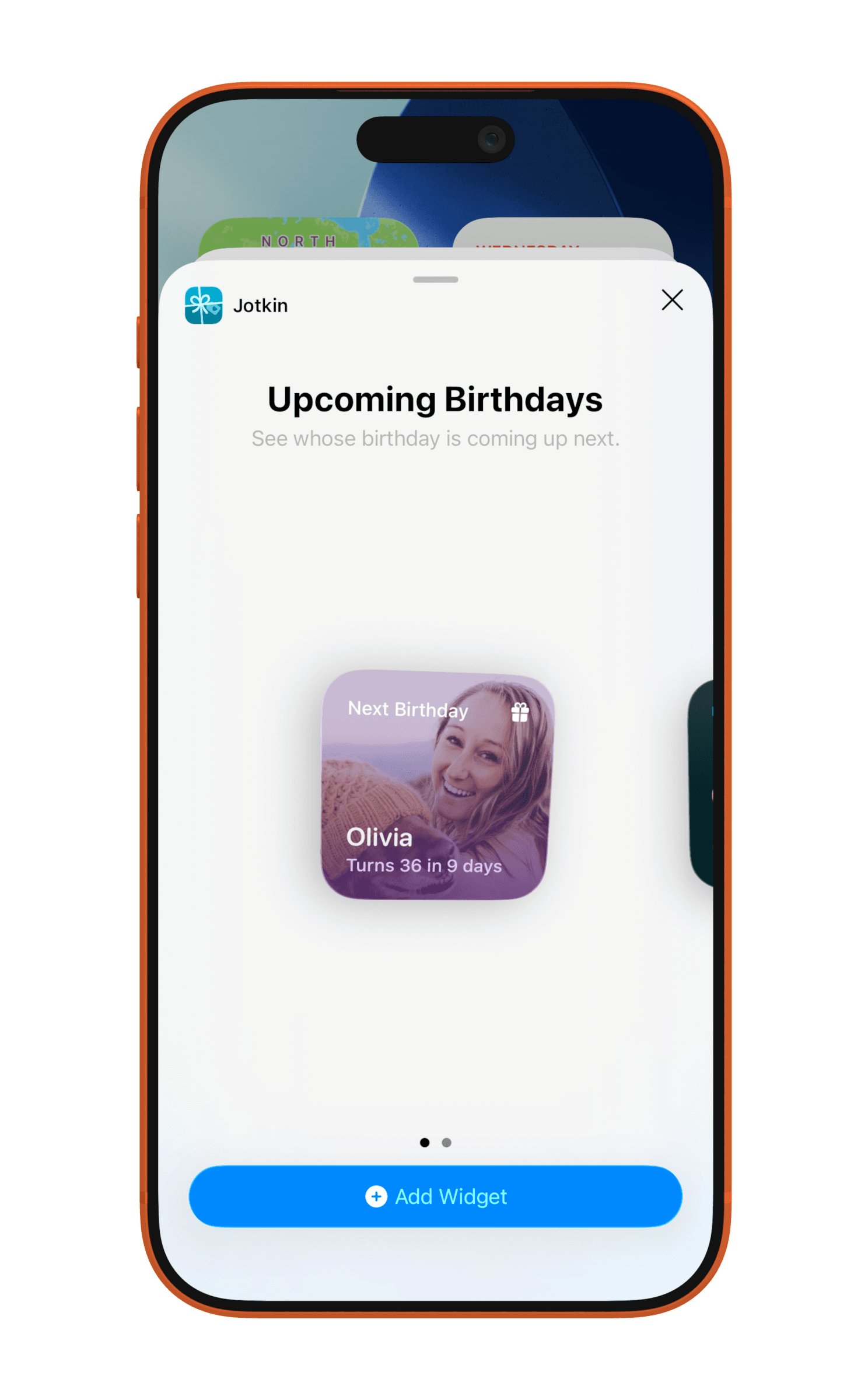
Small widget
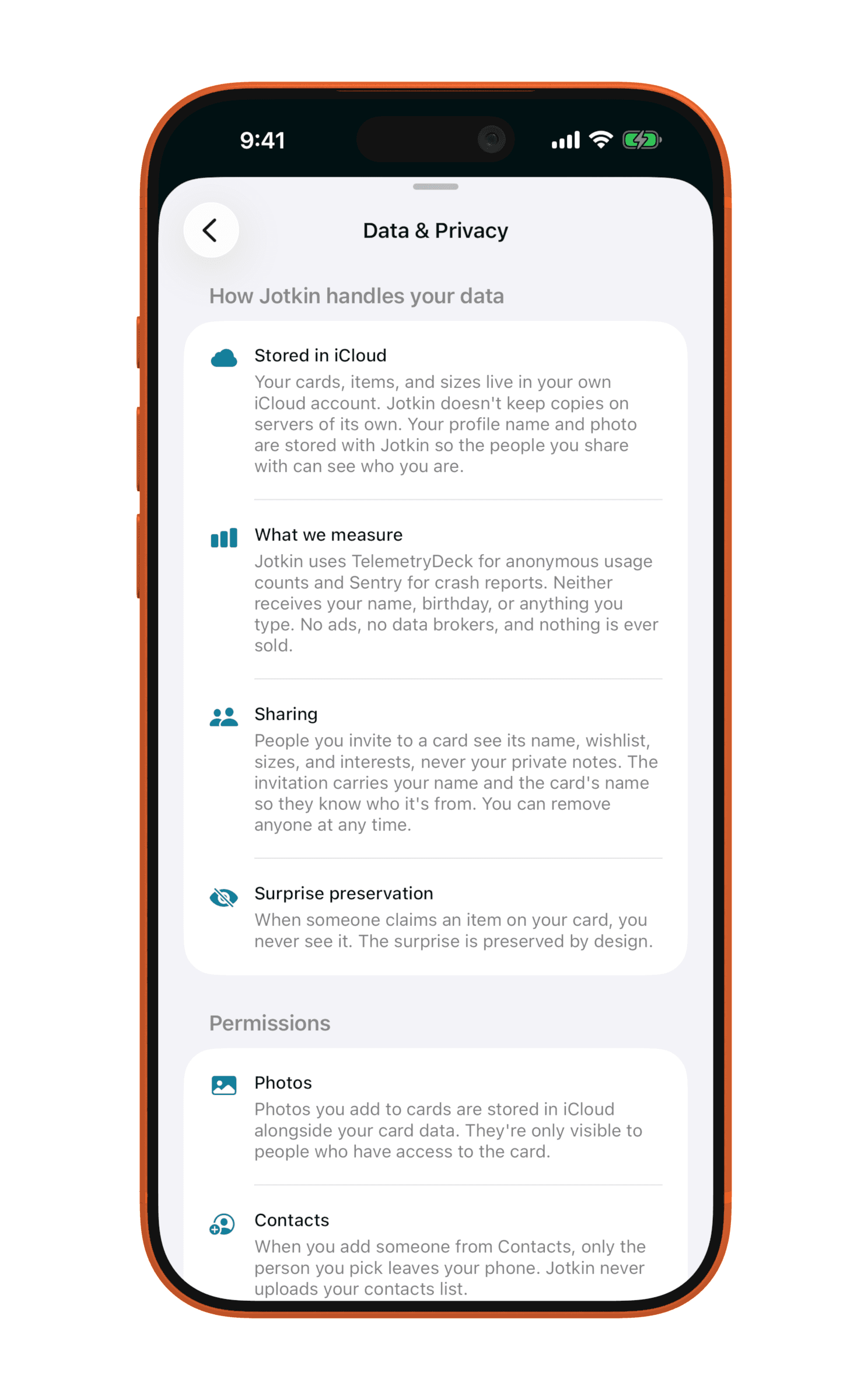
Private notes and items
Overall concept
Background. I first had the idea for Jotkin around 2014 but it never seemed worth the dev time to create. In early 2026 I picked it back up as a test to see how far one person could get with AI. I was looking for a simple idea, an iOS-only app to experiment with new Apple features: widgets, Liquid Glass, on-device processing, size classes, and so on. The goal: ship a first version, learn more about user engagement, navigate user feedback, and get more experience with marketing and distribution.
What problem are we solving? Years ago, I was focused on clothing sizes and sharing those with friends and family so they knew our up-to-date sizes and we’d know theirs.
Returning to the idea this year, the sizes concept felt more like a small aspect of something bigger; so I added features to round out a more gift-focused product organized around the person: their sizes, their wishlist ideas, current interests, and what you’ve given them in the past.
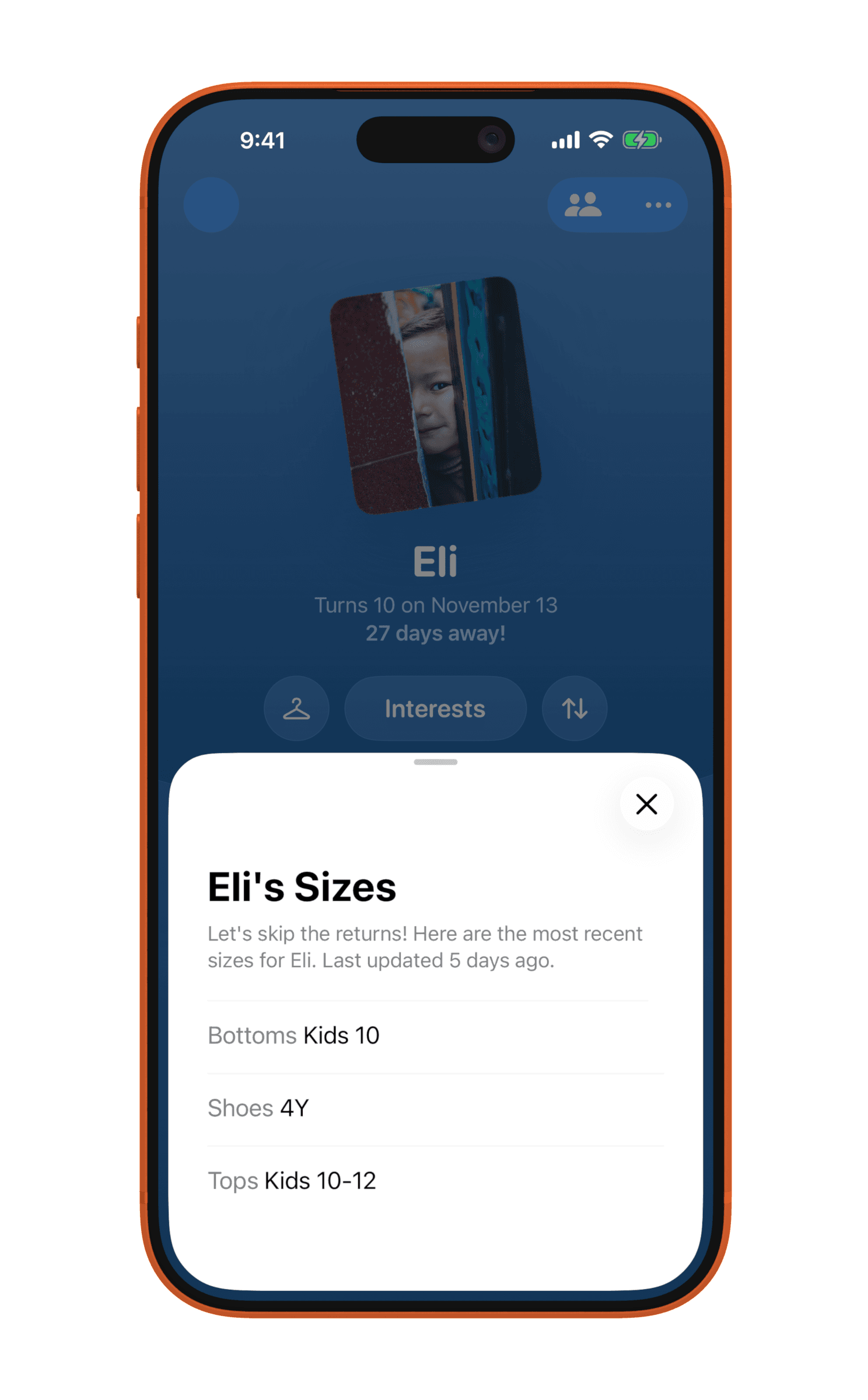
Sizes
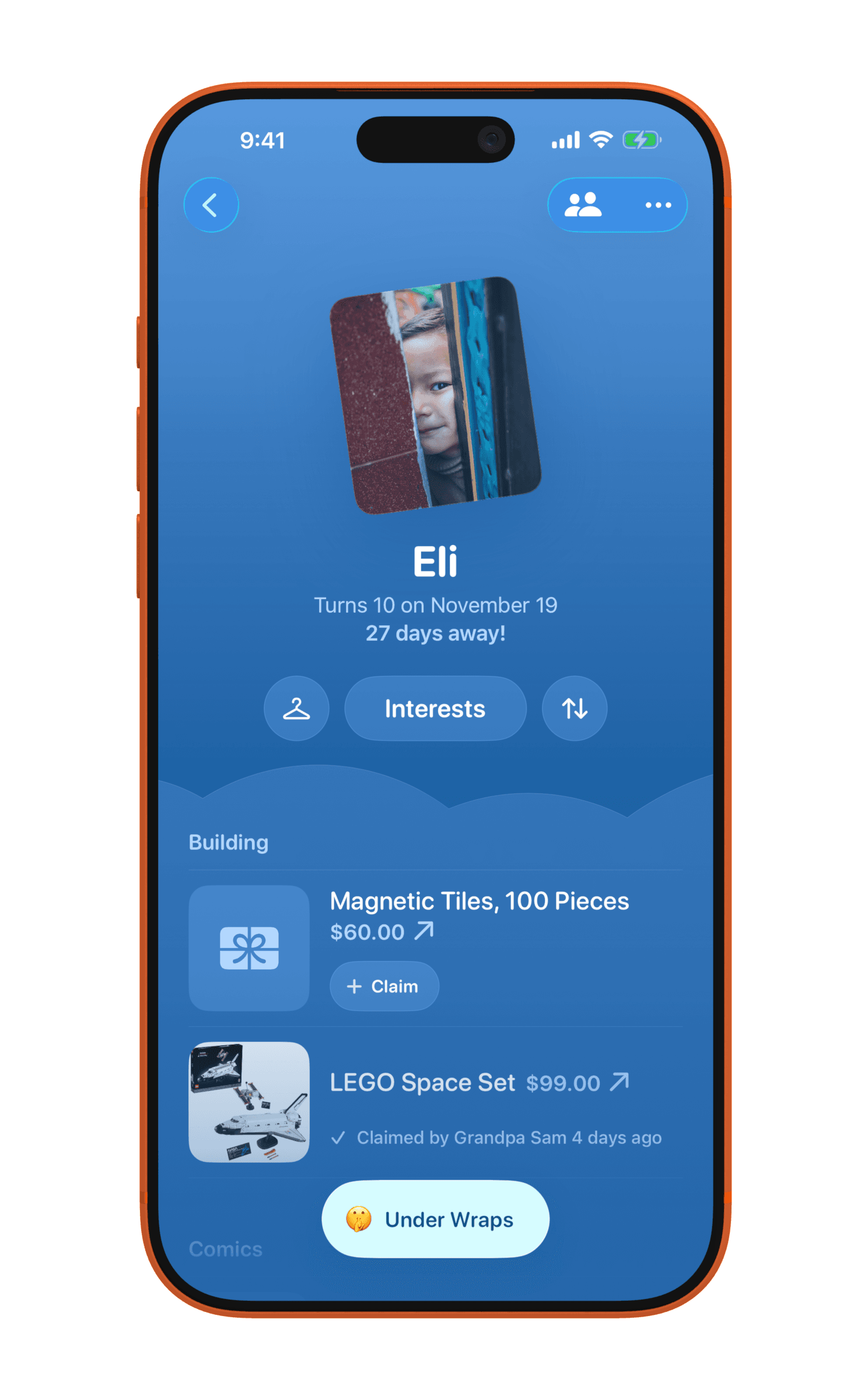
Wishlist items
Interests
Process
I created a design brief to outline and organize what I wanted to build, then broke all of that down into tickets in Linear. I started sketching out some basic screen layouts and flows and kept coming back to a cloud visual as a playful nod to digital sharing. This ended up being a centerpiece in the card details screens and is still there today. Over in Figma I started with the white clouds, then tans and browns to have a more neutral stance, finally arriving at bolder colors so a Card felt themed and more personal. I added some onboarding screen designs, then paywall screens, a feedback screen, and widgets.
As things progressed, I kept designing the screens and planning interaction details as Claude wrote the code. It largely felt like working with a developer, reviewing screens and giving feedback. I was able to focus on how the product felt, and what came next.
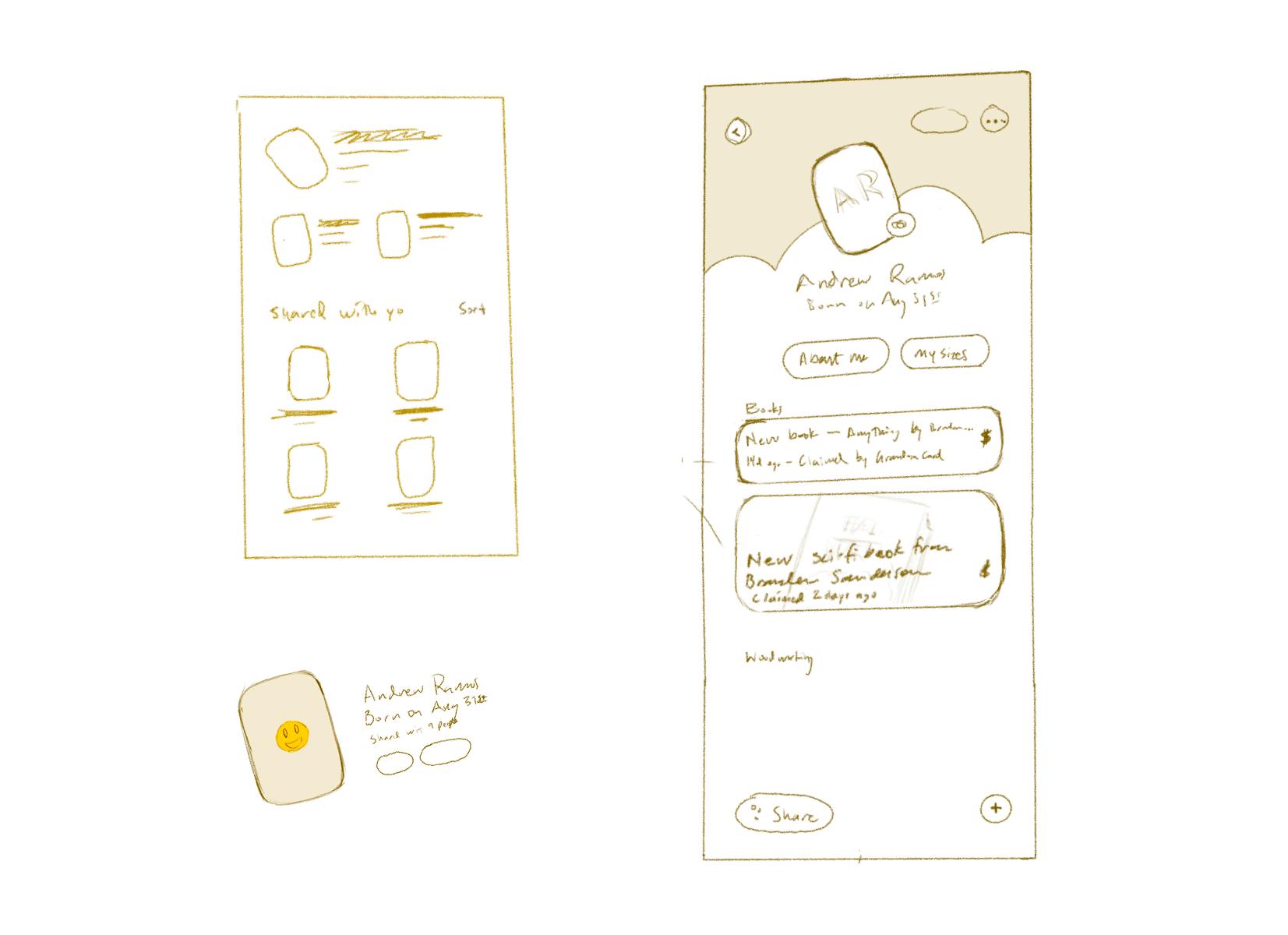
Tech stack
I started in Claude Code and switched to Bitrig (it layers specific iOS knowledge over your preferred agent) midway, since it’s focused on building native Swift apps.
- FigmaDesign
- GitHubCode
- VercelMarketing site and the future web view of cards
- SentryCrash and bug reports
- TelemetryDeckPrivacy-focused analytics
- LinearTickets and organizing work
- TestFlightTesting new features with users
- LoopsNewsletter and system emails